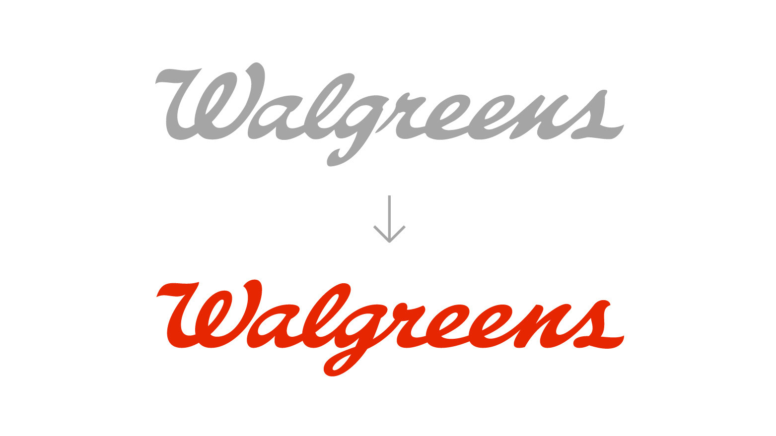
Redesign of one the largest pharmacy chains in the US. We refined the founder's signature and transformed it in a red thread that guides and connects consumers through illustration, iconography and environmental design. Alongside the red thread, a simplified shorthand W that interacts with relatable photography. Transforming Walgreens from an impersonal pharmacy to a neighborhood citizen at every touchpoint.
Agency: Design Bridge
Team: Nei Valente and Marlee Bruning (Lead Designers); Neil Whitfield (Design Director); Sam Cutler (Creative Director); James Morgan (Motion); Josh Clare (Production); Leslie Benzing (Implementation Design); Rob Clarke (Wordmark Refinement); Claire Parker (Executive Creative Director); Stefanie Gilmore (Strategy); Emily Johns and Steffie Palang (Client Services)
Logo - Before and after

